Apply, renew and track, right from the homepage
A redesign of the Electrotechnical Certification Scheme website that puts cardholders’ everyday tasks first, on desktop and phone.
ecscard.org.uk

Everyday tasks up front
People come to the ECS website with a job to do: applying for a card, renewing one or checking on an application. The redesign puts those three tasks in a bar across the top of every page, with the MyECS and Employer Portal logins beside the logo.
On the homepage, four clear panels lead to applying for a first card, renewing or tracking, the ECS Employer Portal and information about the card itself. Each has a short explanation and a Learn More button, so nobody has to guess where to start.

Designed for phones too
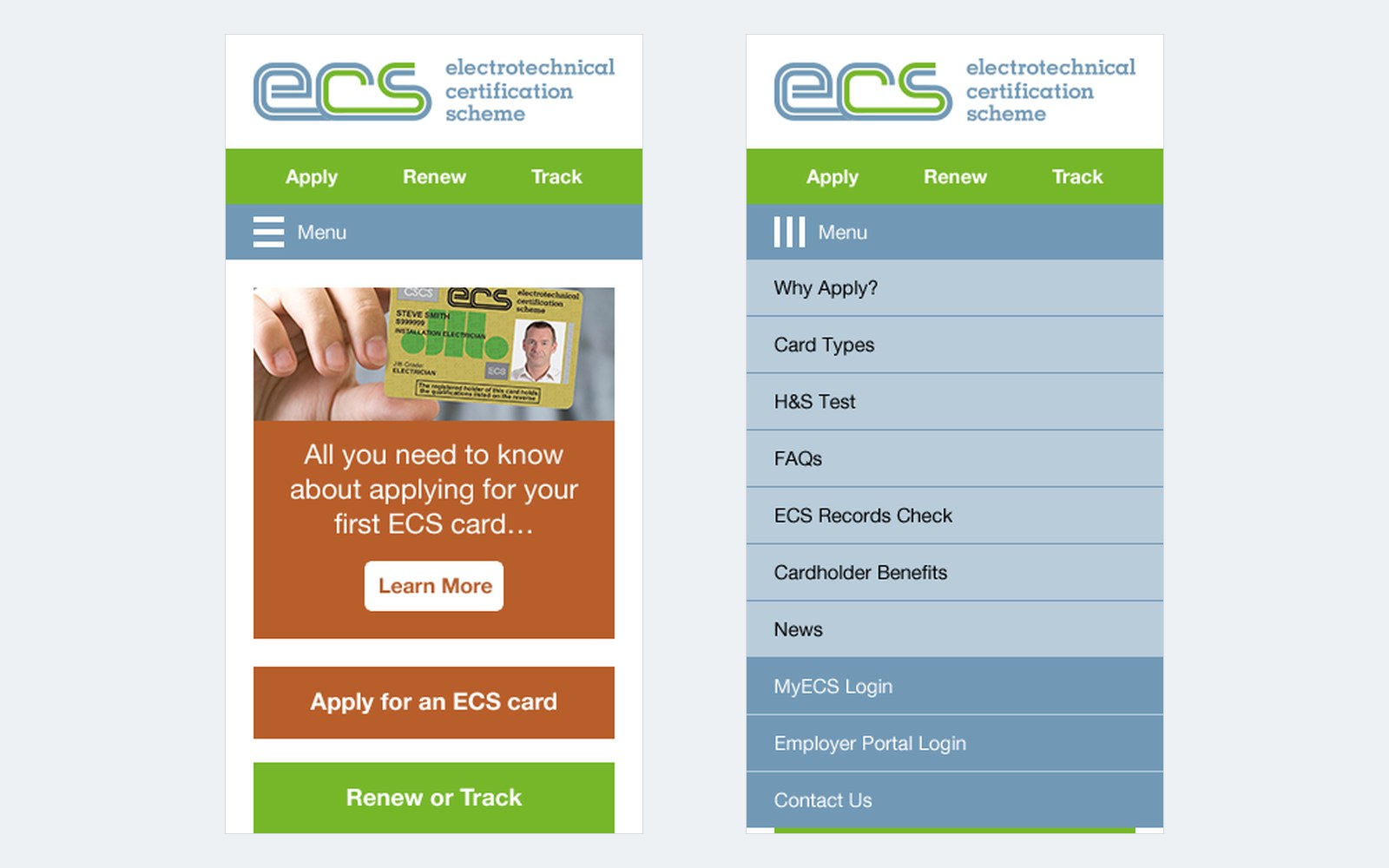
The redesign included mobile layouts for the key pages, drawn for a phone screen rather than shrunk from the desktop. Someone looking something up away from a desk gets the same routes as someone sitting at one.
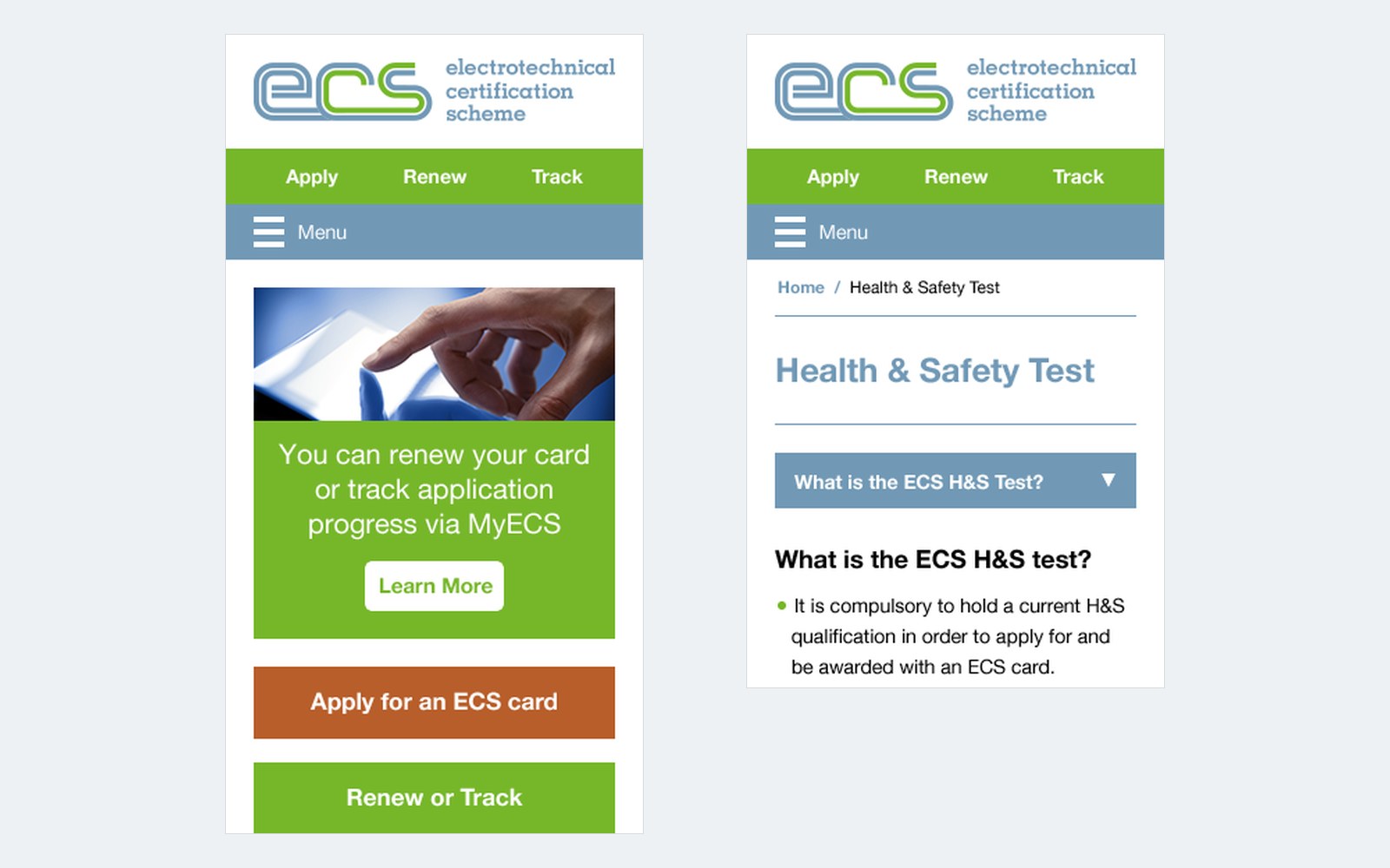
On a phone, Apply, Renew and Track stay within reach at the top, the homepage panels become large buttons that are easy to tap, and a single Menu button opens the rest of the site: Why Apply?, Card Types, the H&S Test, FAQs, ECS Records Check, Cardholder Benefits and News, along with the MyECS and Employer Portal logins.
Card information that’s easy to find
Before applying for an ECS card, people want to know which card suits them, how the health and safety test works and what a card offers. The redesign gives each topic its own clearly named page (Why Apply?, Card Types, the H&S Test, FAQs, ECS Records Check and Cardholder Benefits), reachable from the navigation on every screen.
Inside, the pages use plain headings, breadcrumbs and sections that open when tapped, so people can find the answer they need without reading everything else first.
The right route for each nation
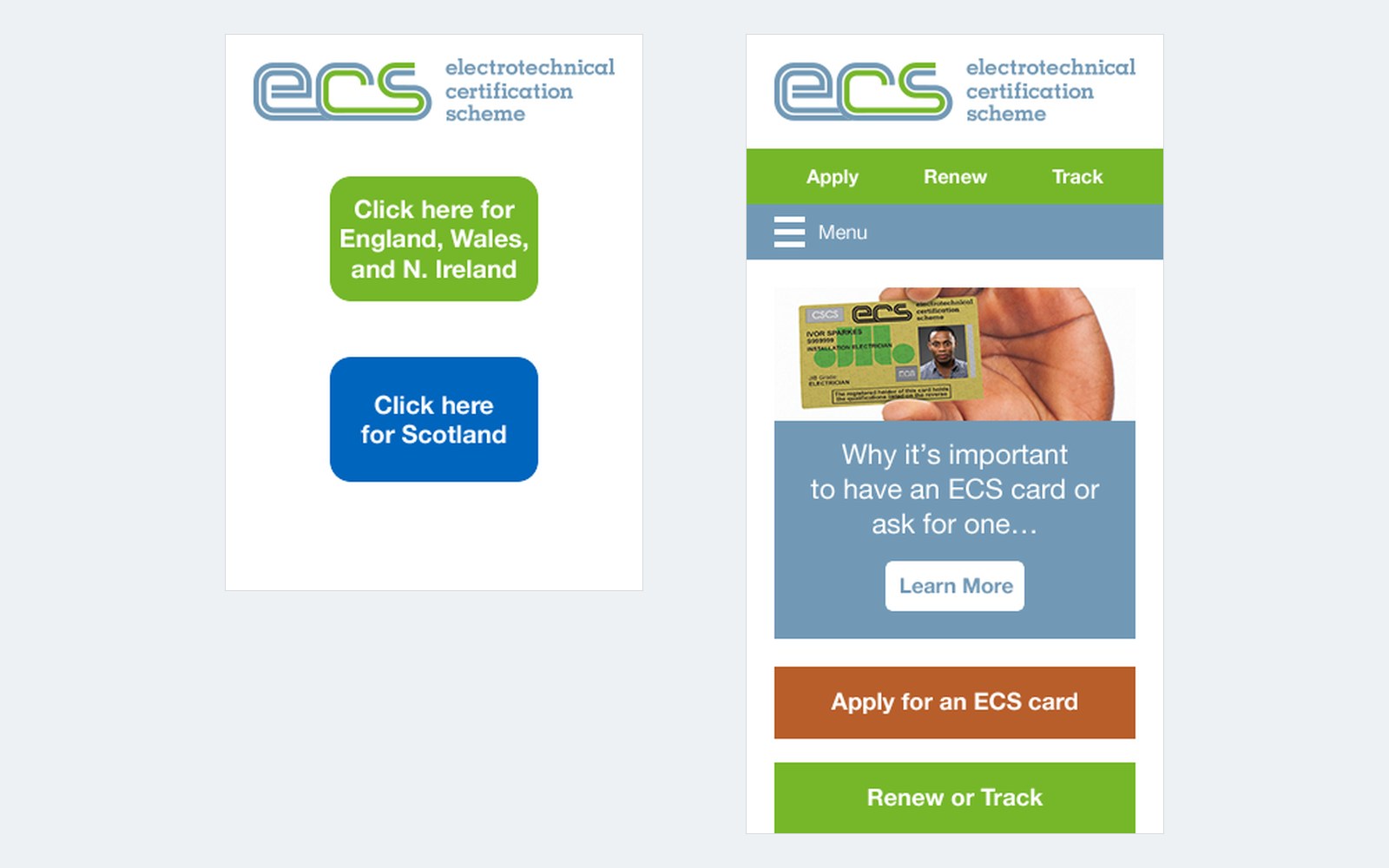
The scheme is administered separately for England, Wales and Northern Ireland, and for Scotland. A simple landing window asks visitors which applies to them, with one clear button for each, so they reach the right applications and information first time.
News has its own place too. The homepage shows the latest announcement, such as the new MyECS online facility for cardholders, and the News section keeps updates together in one place.
A card website built around what people come to do
Related service: Assessment Platforms
Related Case Studies
A website that wins housebuilders’ trust
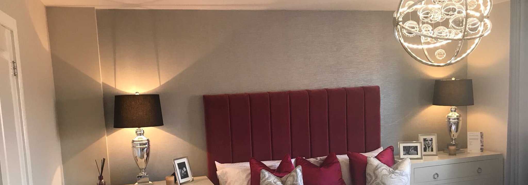
A website that shows housebuilders an electrical contractor’s projects and credentials, and helps it recruit electricians and apprentices.
Read the story
Fittleworth
A certificate-based encryption module, built in 2015, that protected sensitive data behind Clinical Respect for the home dispensary service Fittleworth.
Read the story
LifeStyle AV
A website for LifeStyle AV, an Eastbourne specialist in pre-owned Bang & Olufsen, with detailed product pages, online reservations and a selling service.
Read the story